
Every part of our logo means something. Here's the story of how we found CASE's identity...
OUR BRANDEvery part of our logo means something. Here's the story of how we found CASE's identity...
OUR BRANDcomprehensive accessibility support in education
comprehensive accessibility support in education
CASE began as an idea we needed a name and identity for - something that captured what we'd actually grown into, not just what the acronym stood for on paper.
WHERE WE STARTED
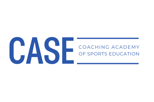
CASE started life as the Coaching Academy of Sports Education - a name and a mark that did their job, but no longer reflected what we'd actually become.
As the organisation grew into mental health support, assistive technology, and expert mentoring for SEND learners, it was clear the brand needed to change with it. This is the story of that change.
THE NAME
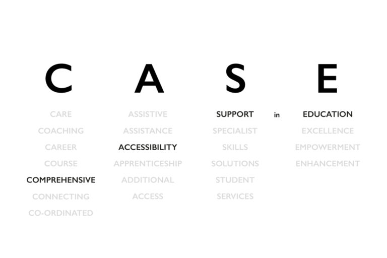
Before any logo work started, we went back to basics: what does every letter really mean? What's the version of this name that tells people exactly what we do the moment they read it?
That question - more than any mood board - is what shaped everything that came after...
Understanding the sector
Before drawing anything, we looked outward - at how assistive technology providers, SEND charities, and neurodiversity organisations present themselves. A lot of that space lean on soft colours and calming, careful language, for good reason. But it also meant a lot of brands started to blur together. If CASE was going to be memorable, it needed to feel warm and safe and stand on its own.

Finding the right voice
Even the choice between CASE, Case, and case says something. Capitals felt clinical. Lowercase felt closer to how we actually wanted to come across - approachable, human, not shouting about what we do. Small decisions like this ran in parallel with everything else, because tone of voice and visual tone had to agree with each other.
The message behind the message
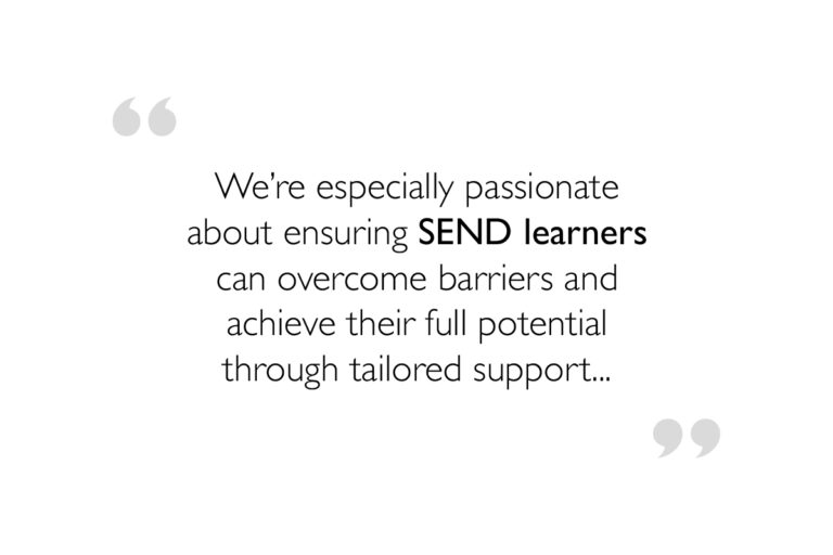
Somewhere in the middle of the process, one line kept surfacing above everything else.
That word - support - summarised everything CASE offers, from mental health support to assistive technology to expert mentoring. Once we saw it written down plainly, the direction for the brand became obvious.
Purposeful dead ends
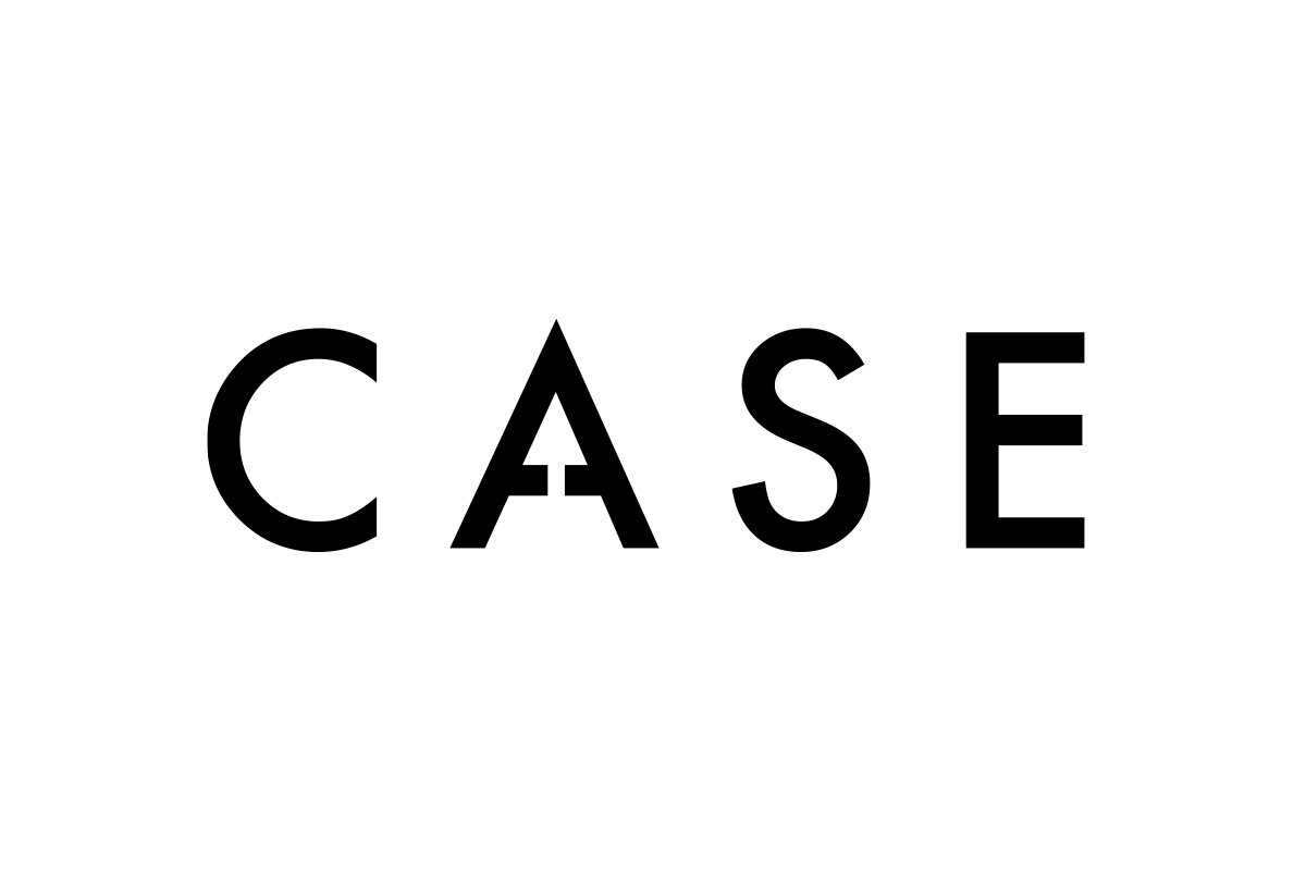
We went through dozens of directions before landing on the one that stuck - a nod to braille and accessibility, a path or journey running through the letters, a door opening onto something new.
None of these were wrong exactly. They just weren't right.
JOURNEY CONCEPT
A concept about the journey learners take with us.
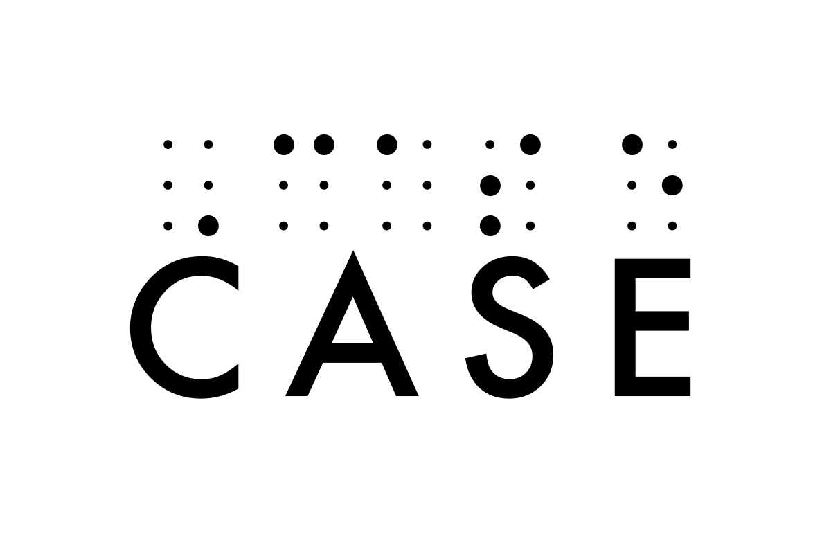
ACCESSIBILITY CONCEPT
An accessibility-first concept, built around braille.
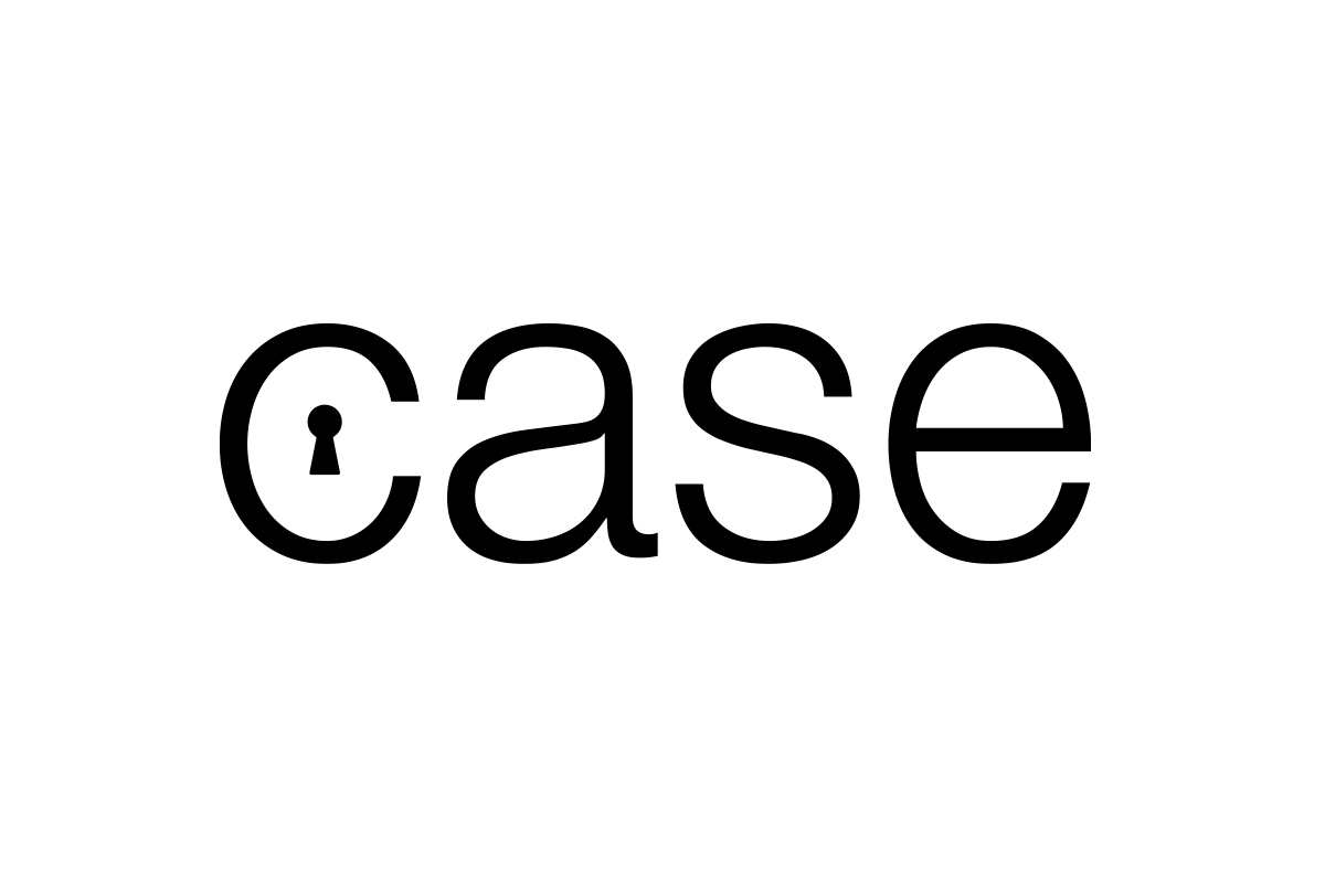
OPPORTUNITY CONCEPT
An 'opportunity' concept - the door CASE opens.
THE TURNING POINT
Once we mapped out the three things CASE genuinely delivers - mental health support, assistive technology, and expert mentoring - a single identity started to emerge underneath all three:
"CASE provides the missing piece every learner needs to reach their full potential."
Not a list of services. A single idea.
Support is the missing piece.
The idea that made it click: support defines CASE.
The brand needed to say that visually, not just describe it.
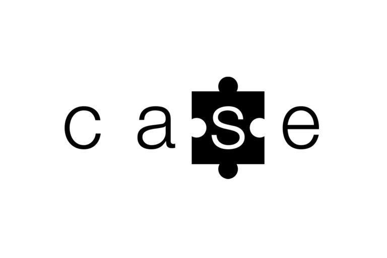
SUPPORT DEFINES CASE
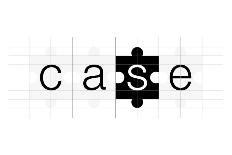
The S in CASE became a puzzle piece - literally the missing piece that completes the word, the same way support completes a learner's journey.
It's a small piece of design, but something that we believe carries a big impact in visually communicating everything that CASE stands for. Even the spacing was refined until the visual balance felt exactly right.
COLOUR WITH A REASON
Every colour in the CASE palette was chosen for what it says, not just how it looks.
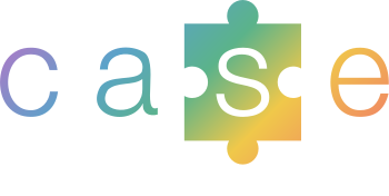
These colours were then purposely blended together as a gradient, to create a subtle nod to the neurodiverse community CASE serves - diversity, represented directly in the brand's own colour story.
Purple
creativity | ambition
Blue
trust | calm
Green
growth | wellbeing
Yellow
optimism | understanding
Orange
warmth | energy
A colour for every service
The gradient isn't just decorative - three of its colours were assigned directly to what CASE actually does, so the colour itself becomes a quiet piece of navigation.
Blue and yellow complete the gradient in between — the connective tissue that ties the three together into one identity, rather than three separate services.
Mental Health Support
Calm, considered, steady.

Assistive Technology
Growth, progress, moving forward.

Expert Mentoring
Warmth, encouragement, a helping held.
This is the mark you'll see across our site, our social profiles, and everything we send out - not because it looks good, but because it communicates everything CASE provides - support.
Five colours chosen with intent, a missing piece that says what we stand for, and a name that finally speaks for itself.
THE STORY OF CASE'S IDENTITY
CASE began as an idea we needed a name and identity for - something that captured what we'd actually grown into, not just what the acronym stood for on paper.
WHERE WE STARTED
CASE started life as the Coaching Academy of Sports Education - a name and a mark that did their job, but no longer reflected what we'd actually become.
As the organisation grew into mental health support, assistive technology, and expert mentoring for SEND learners, it was clear the brand needed to change with it. This is the story of that change.
THE NAME
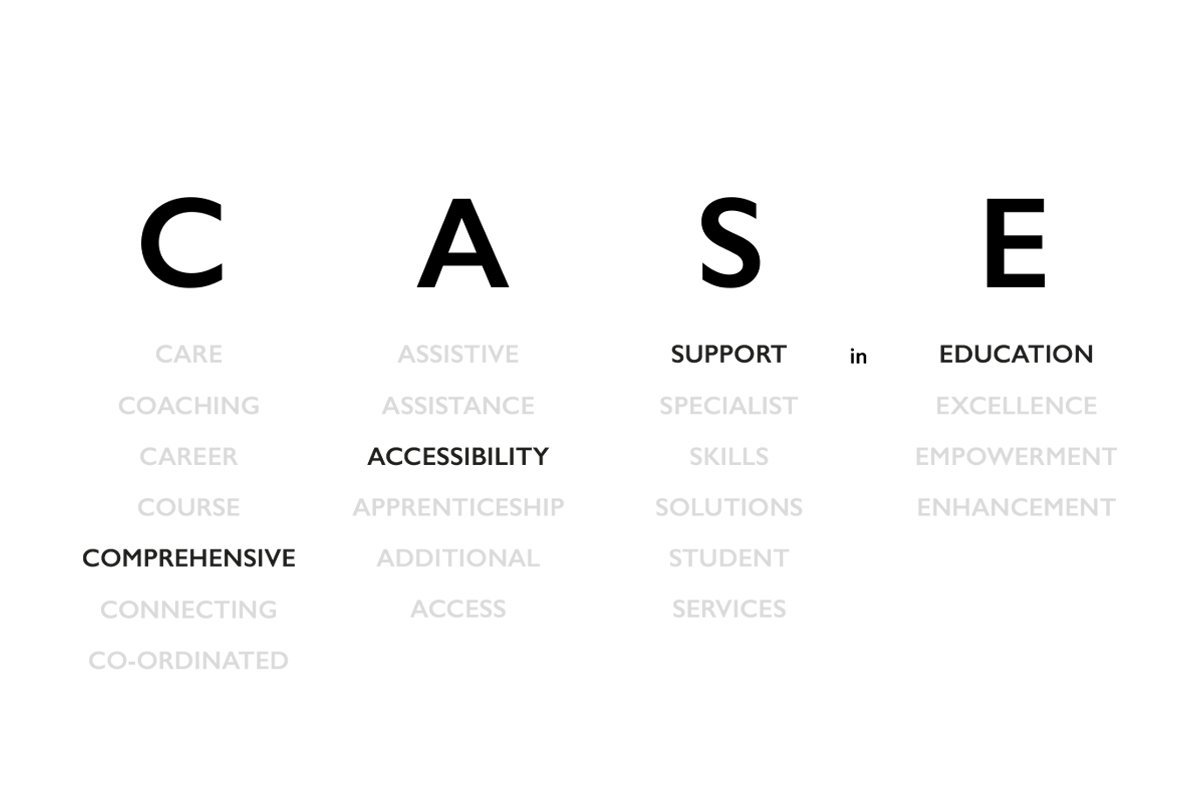
Before any logo work started, we went back to basics: what does every letter really mean? What's the version of this name that tells people exactly what we do the moment they read it?
That question - more than any mood board - is what shaped everything that came after...
Finding the right voice

Even the choice between CASE, Case, and case says something. Capitals felt clinical. Lowercase felt closer to how we actually wanted to come across - approachable, human, not shouting about what we do. Small decisions like this ran in parallel with everything else, because tone of voice and visual tone had to agree with each other.
The message behind the message
Somewhere in the middle of the process, one line kept surfacing above everything else.
That word - support - summarised everything CASE offers, from mental health support to assistive technology to expert mentoring. Once we saw it written down plainly, the direction for the brand became obvious.
Purposeful dead ends
We went through dozens of directions before landing on the one that stuck - a nod to braille and accessibility, a path or journey running through the letters, a door opening onto something new.
None of these were wrong exactly. They just weren't right.
PROGRESS CONCEPT
A concept about the journey learners take with us.
ACCESSIBILITY CONCEPT
An accessibility-first concept, built around braille.
OPPORTUNITY CONCEPT
An 'opportunity' concept - the door CASE opens.
The turning point
Once we mapped out the three things CASE genuinely delivers - mental health support, assistive technology, and expert mentoring - a single identity started to emerge underneath all three:
"CASE provides the missing piece every learner needs to reach their full potential."
Not a list of services. A single idea. Support is the missing piece.
THE FINAL CONCEPT
The idea that made it click: support defines CASE.
The brand needed to say that visually, not just describe it.
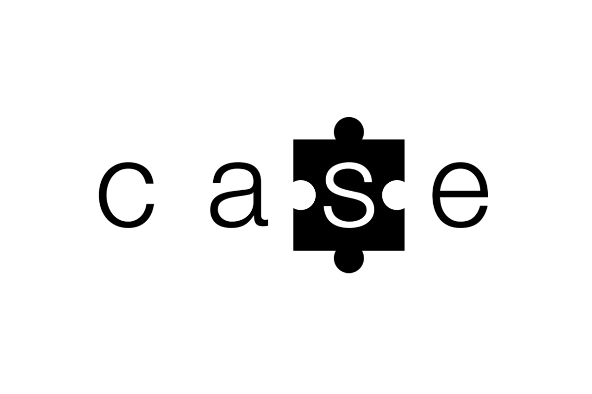
SUPPORT DEFINES CASE
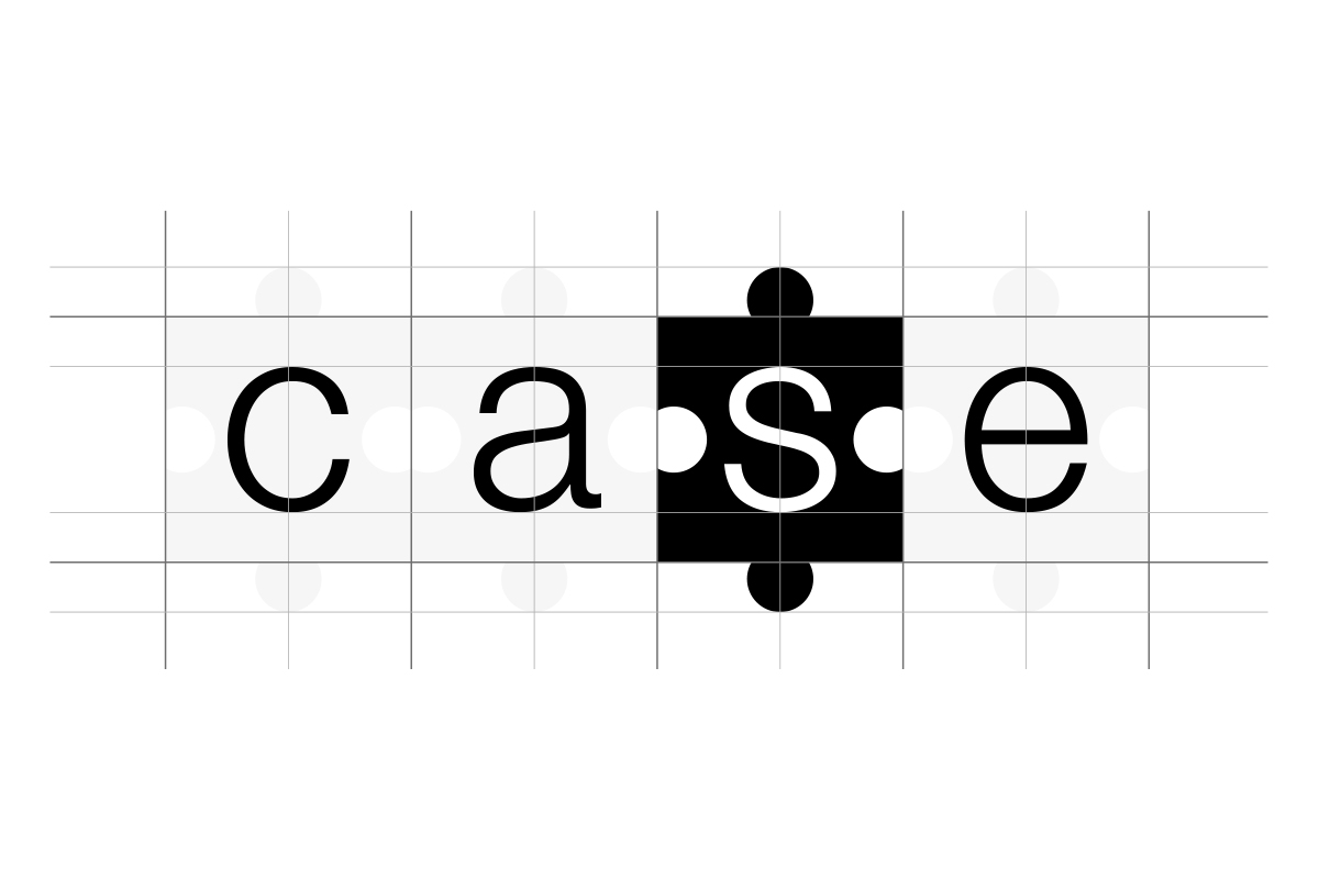
The S in CASE became a puzzle piece - literally the missing piece that completes the word, the same way support completes a learner's journey.
It's a small piece of design, but something that we believe carries a big impact in visually communicating everything that CASE stands for. Even the spacing was refined until the visual balance felt exactly right.
COLOUR WITH A REASON
Purple
creativity | ambition
Blue
trust | calm
Green
growth | wellbeing
Yellow
optimism | understanding
Orange
warmth | energy
Every colour in the CASE palette was chosen for what it says, not just how it looks.
These colours were then purposely blended together as a gradient, to create a subtle nod to the neurodiverse community CASE serves - diversity, represented directly in the brand's own colour story.
A colour for every service
Mental Health Support
Calm, considered, steady
Assistive Technology
Growth, moving forward.
Expert Mentoring
Warmth, a helping held.
The gradient isn't just decorative - three of its colours were assigned directly to what CASE actually does, so the colour itself becomes a quiet piece of navigation.
Blue and yellow complete the gradient in between — the connective tissue that ties the three together into one identity, rather than three separate services.
THE BRAND TODAY
This is the mark you'll see across our site, our social profiles, and everything we send out - not because it looks good, but because it communicates everything CASE provides - support.
Five colours chosen with intent, a missing piece that says what we stand for, and a name that finally speaks for itself.